coffee in colour: the story behind our new labels
This is a project we’ve been working on for a while.
And while you can see the end result on our packaging, we wanted to take you behind-the-scenes to explain how this change happened—and the thinking behind it.
But before we look forward, let’s take a step back.
the limitations of our old system
Until recently, our coffees were grouped into five categories: citrus, exotic, floral, rich, and sweet.
These served us well for a time and made it easy to navigate different tastes at a glance. But over time, we found ourselves limited by the very labels we had created.
Coffee is one of the most chemically complex substances we consume and can contain over 1,000 chemical compounds—far more than wine. To box something this complex into five tidy buckets started to feel reductive.
We knew there was more we could be saying.

our five former categories![]()
how the colour purple changed everything
The shift began with a moment in the cupping room—one of those moments we’ll never forget.
Our Roastery Manager & Green Coffee Buyer, Niko, was tasting a coffee with the team when, instead of reaching for the usual flavour wheel terms, he said:
“This coffee tastes... purple.”
Everyone knew exactly what he meant, and instantly connected the colour to the taste. It wasn't blackberry, cassis, or plum. It was just...purple.
That’s when it clicked.
from colour to clarity
Inspired by this, we began exploring a method more commonly used in the wine and food industries—crossmodal correspondence. This is where our brains perceive connections between what we see, nose, and taste to arrive at an overall impression.
Using colour as the first step suddenly unlocked something for us. It gave us a faster, more intuitive, more accurate way to communicate taste.
Instead of starting with a specific and finalised tasting note, we could now start with a first impression and move toward specific tasting notes.

the sidra that set the standard
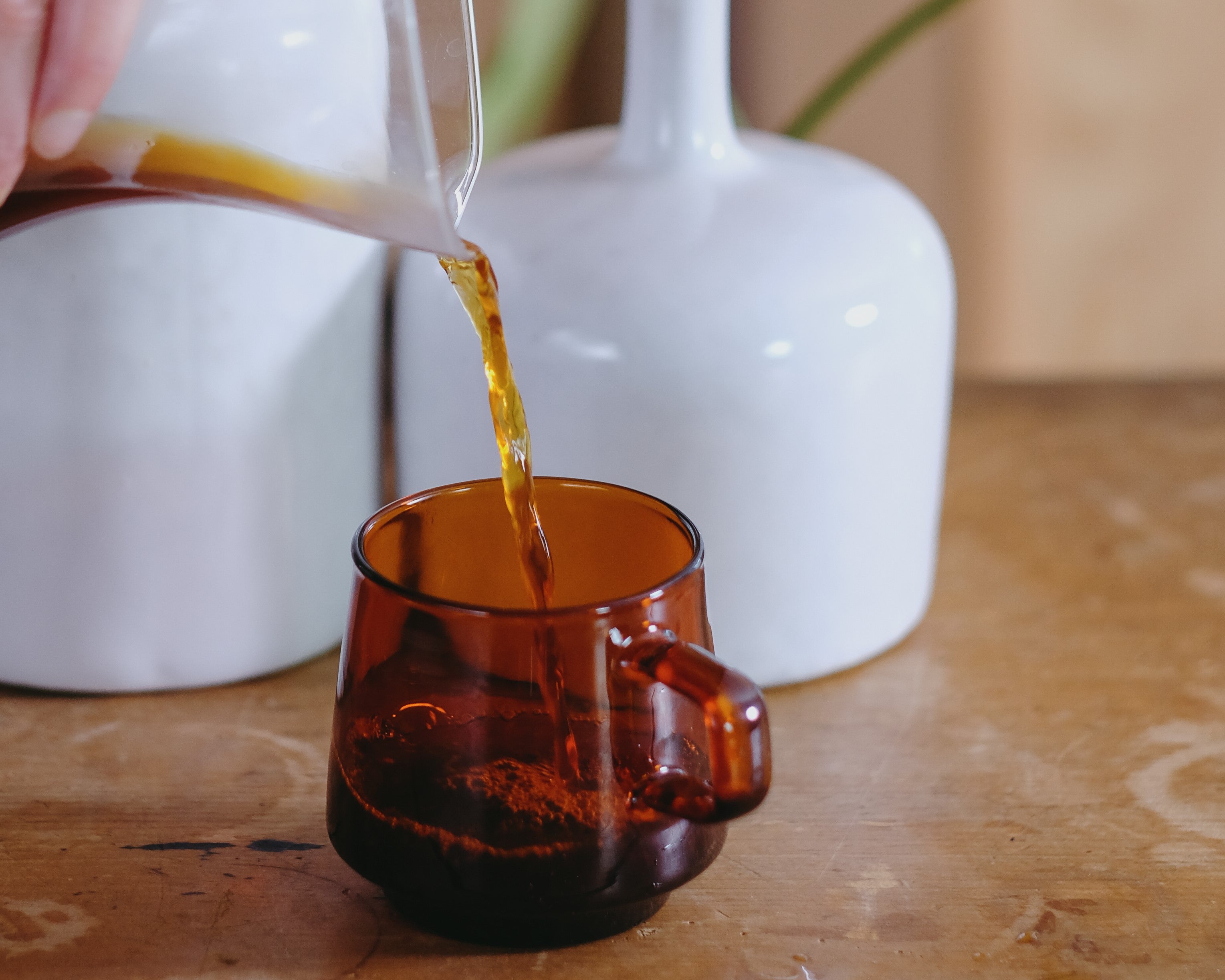
The breakthrough became real during a cupping of Wilder Lazo’s White Honey Sidra.
It was a quiet, layered coffee. We found it hard to pin down with our usual lexicon. So we cupped it by colour.
We described the cup as:
- teal (cardamom)
- light yellow (camomile)
- muted green (rosemary)
Rather than forcing it into a taste category, we let it speak through tone and hue. It just made sense.
From that point on, we made the decision to cup our coffees by colour first.
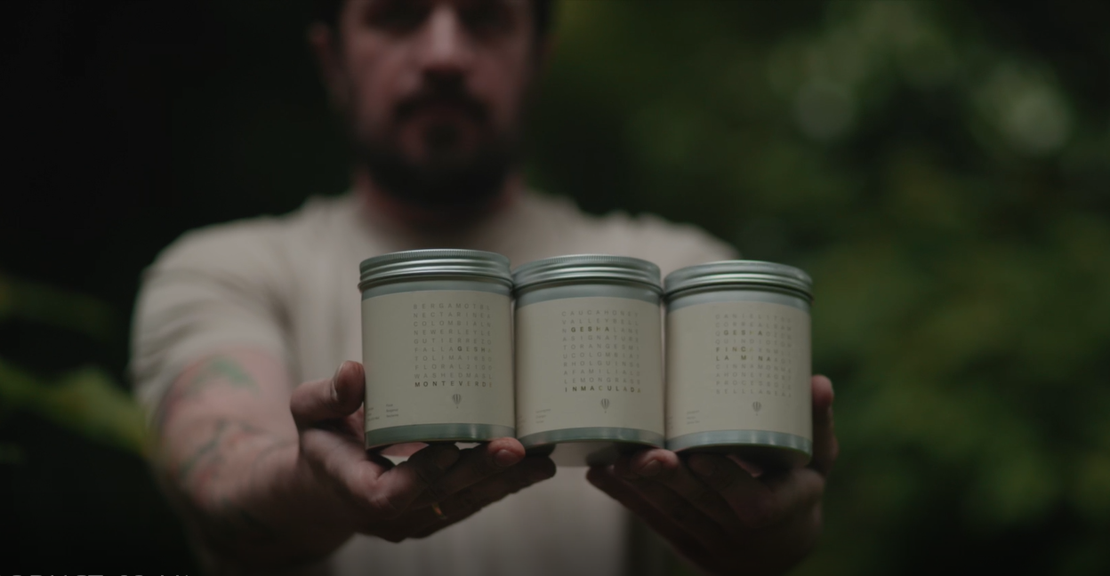
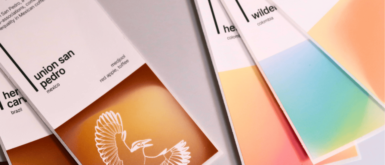
how the new labels work

1. colour
We start with colour as a sensory anchor—a first impression that speaks to the taste inside. Brown might evolve to become milk chocolate, or nuts, or dates. Over time, orange can end up as blood orange, or nectarine, or clementine.
By agreeing on an overarching colour first, we create a shared starting point for understanding the coffee's character—before diving into more specific tasting notes,
Each coffee typically features three tasting notes (sometimes four), with the first note the most prominent—the one that defines the coffee at first sip.

2. lines
Each label also features line work designed to reflect the clarity, depth of taste and mouthfeel in the cup.
- more lines = more separation and definition in the cup (typically filter coffees)
- fewer lines = more cohesion and roundedness (often espresso coffees)
Think of it as a texture preview before you take your first sip.

3. brightness
We also introduced a subtle brightness bar—a sliding scale on the label that indicates where each coffee sits on the spectrum from filter to espresso.
It’s not about roast level—it’s about brew style.
- brighter = more clarity, better suited to filter brewing
- darker = more body, geared toward espresso

coffee with impact
As a Certified B Corp, we care deeply about the impact our coffees make at origin. Some coffees in our range go even further—championing sustainability, equity, and long-term community growth.
To honour this, we've incorporated a series of icons into our label system—each one drawn from the story of the producer or collective behind the coffee.
You’ll spot the great kiskadee representing Union San Pedro, the coffee-bean-carrying figure of La Morena, and the bold bull of Enrique López. These are our way of highlighting the coffees doing more—for people, planet, and future generations.
try it for yourself
Whether you’re a seasoned cupper or new to specialty coffee, we want to help you connect with taste—not decode it. Our labels are here to invite curiosity, spark recognition, and pay homage to the complexity of the coffee inside.