meet the artist behind our labels
Meet Paul Flaherty—artist, in-house creative, and all-round coffee head.
Paul is the creative force behind our new labels, blending a deep understanding of coffee with a distinctive visual approach rooted in colour, form, and feel.
from roastery to creative studio
Paul began his journey at Bell Lane with Niko Sunko in the roastery—packing, roasting, labelling, and doing just about everything in between. This end-to-end view of the production process gave him unique insight into our coffees, operations, and team.
From there, he moved into the creative team, continuing to work closely with the roastery and warehouse. He’s stayed rooted in the day-to-day of coffee—from equipment and brewing to social media, festivals, and new releases. A trained barista with a strong palate, Paul brings coffee knowledge that goes way beyond the design studio.

paul flaherty and niko sunko at dcf 2025
the idea: coffee in colour
While cupping with Niko, Paul seized on the moment when Niko said, “this coffee tastes…purple,” immediately sparking the idea that would become our new label system.
Paul ran with the concept, diving deep into research around crossmodal correspondence and sensory colour theory. His goal was to capture the emotional experience of a coffee—visually—before you even open the bag.

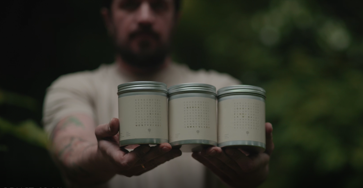
bell lane's new labels, designed by paul flaherty
crafting the new labels
Each label is individually designed to reflect the flavour, mouthfeel, and brightness of the coffee inside.
Paul worked closely with Niko to translate final cupping notes into design language—using colour palettes, line work, and light indicators to express the essence of each cup. You can learn more about that here.
The result is a set of labels that are intuitive, striking, and as layered as the coffees themselves.
The project took six months to complete and involved nearly every part of the business. It’s a system the whole Bell Lane team is proud of—one that reflects the journey of each coffee and the care that goes into every roast.

our new labels on display for the first time at dcf 2025
designing for impact
As a Certified B Corp, Bell Lane places a strong emphasis on coffees that make a meaningful difference. Paul’s labels also highlight some of the coffees that make an extra special impact at origin, incorporating the iconography unique to each producer or collective.
From the great kiskadee of Union San Pedro, to the La Morena woman with a coffee bean, to the bull of Enrique López—these icons mark coffees that go above and beyond in sustainability, equity, and community development.

paul's tóg go bog é concept at dcf
beyond the labels
Paul’s influence stretches across the Bell Lane brand. He’s the hand behind many of our brand illustrations, icons, and event visuals.
At Dublin Coffee Festival, Paul created our much-loved “tóg go bog é” merch range, turning a simple Irish phrase into a welcoming invitation. His illustrations featured on our sweaters, t-shirts, socks—and if you looked closely, you may have even spotted his cockapoo, Red, in the artwork.
If you’re subscribed to our newsletter, you’ll know his doodle well—it’s at the bottom of every email we send. If you're not subscribed already, be sure to sign up here.

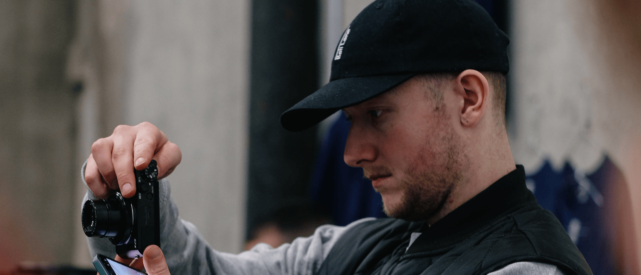
paul flaherty, artist & in-house creative
art & coffee, side by side
Paul’s own artistic practice explores the emotional tension between digital and physical space. He’s recently moved out of Abbey Road Artist Studios in Athlone, and shares his creative process and artwork on Instagram via @paul_flaherty and @paulflahertyartist.
At Bell Lane, we believe great coffee deserves great storytelling—and Paul’s work helps us bring that story to life in full colour. We're excited to see his next steps both in-house and out in the art world.