roasting since 2012


Filter Subscription
Sale price€18.00
/incl. delivery
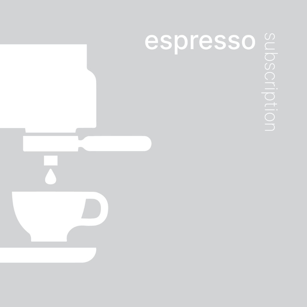
Espresso Subscription
Sale price€27.50
/incl. delivery
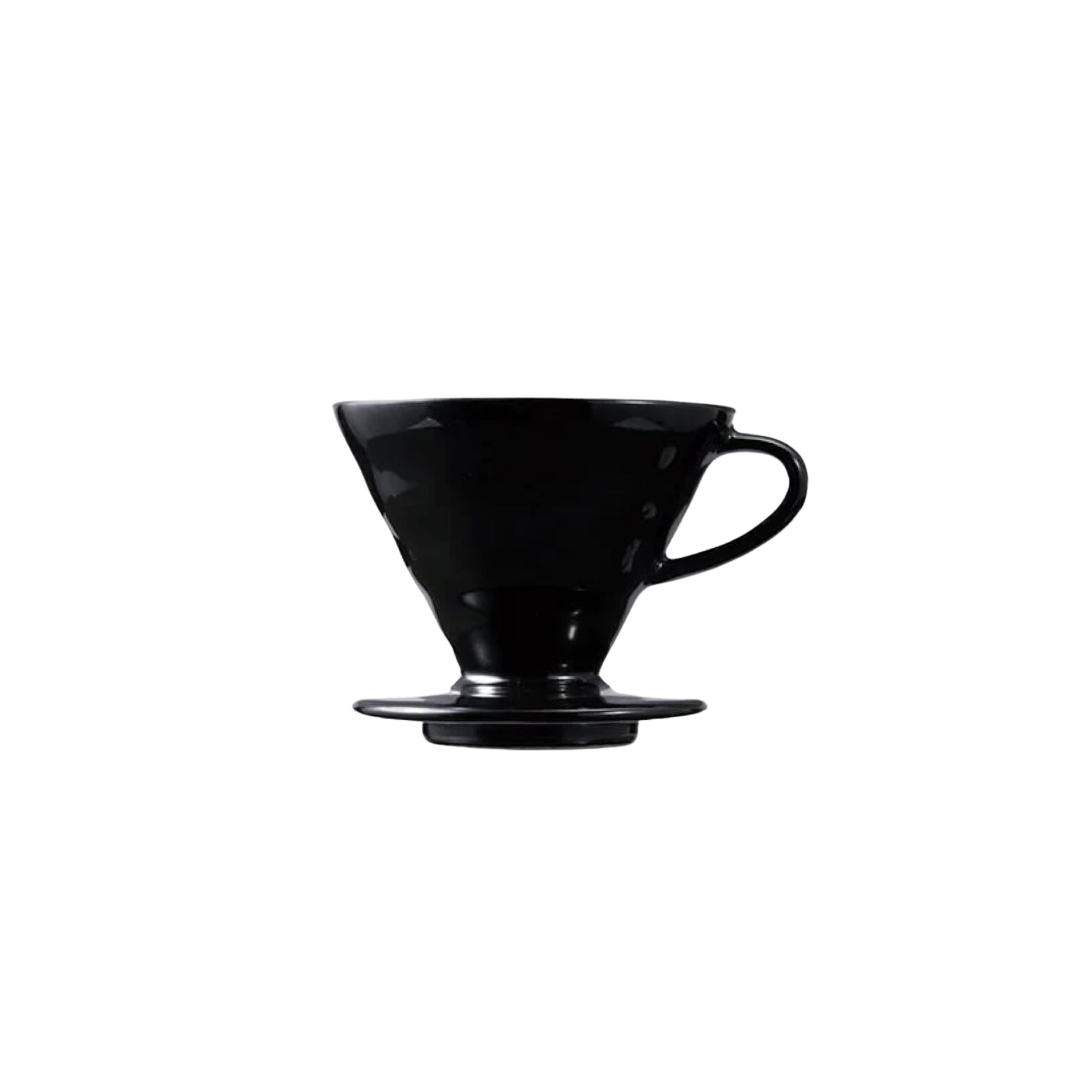
hario x tetsu kasuya v60
Sale price€30.00
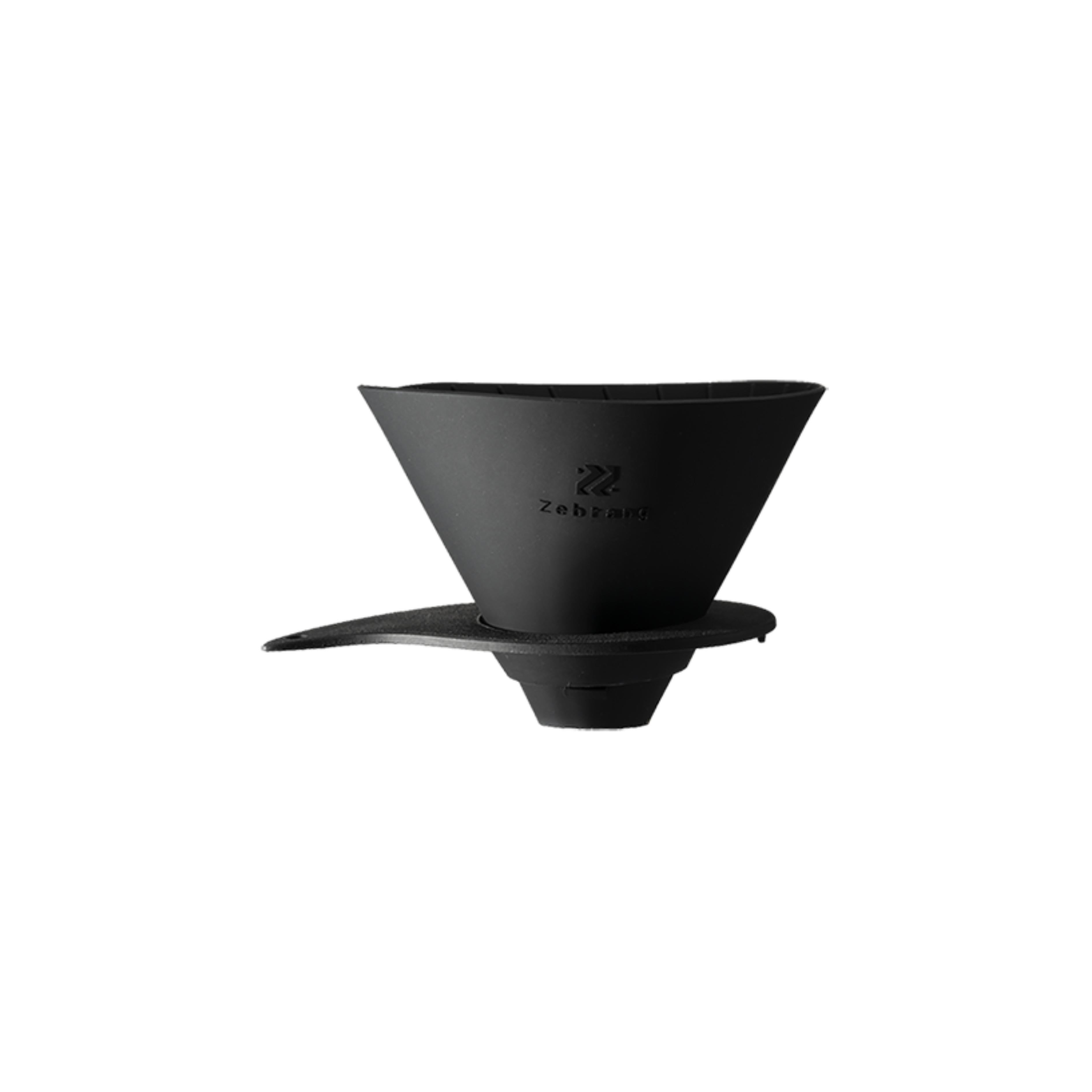
hario zebrang dripper
Sale price€27.00
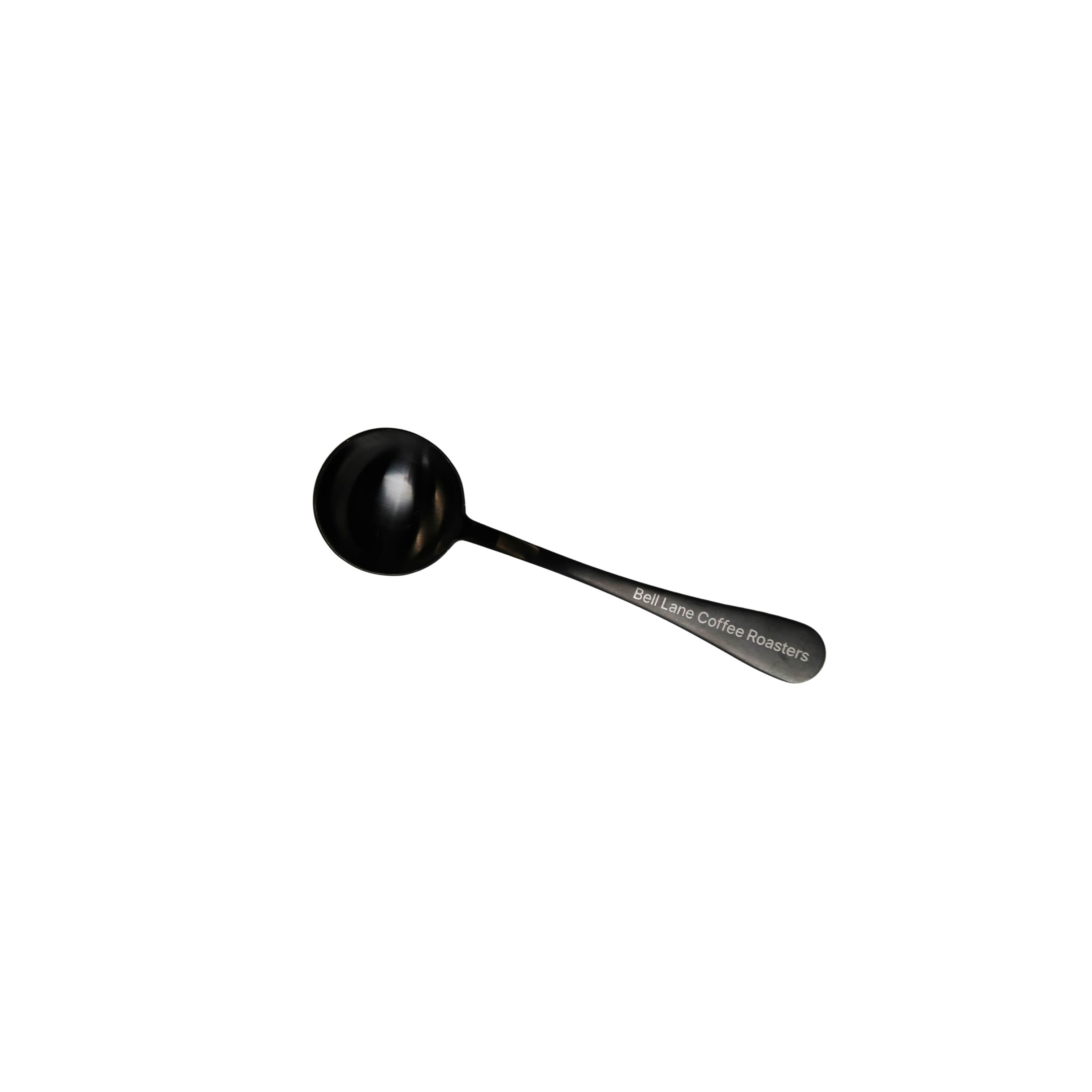
bell lane cupping spoon
Sale price€12.00
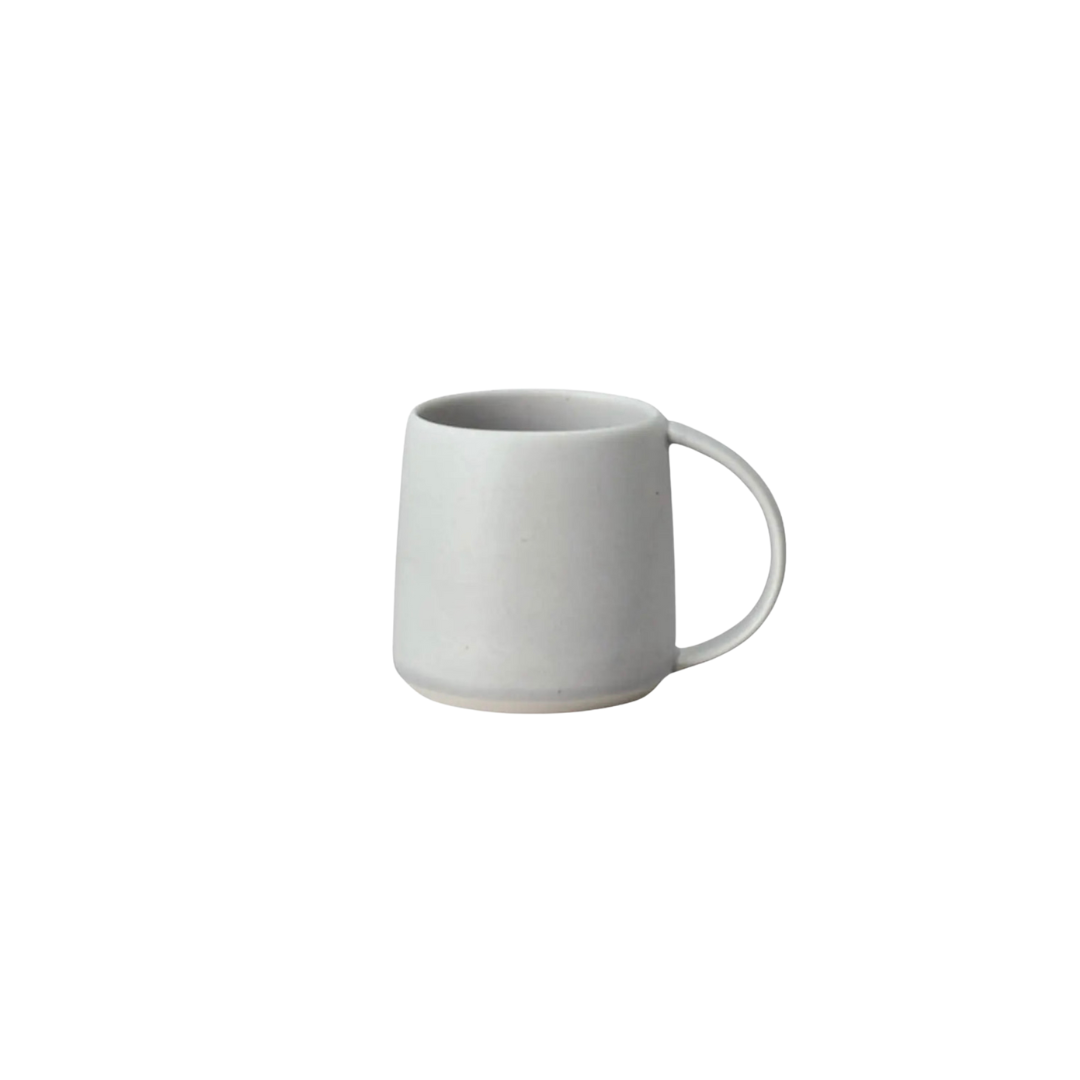
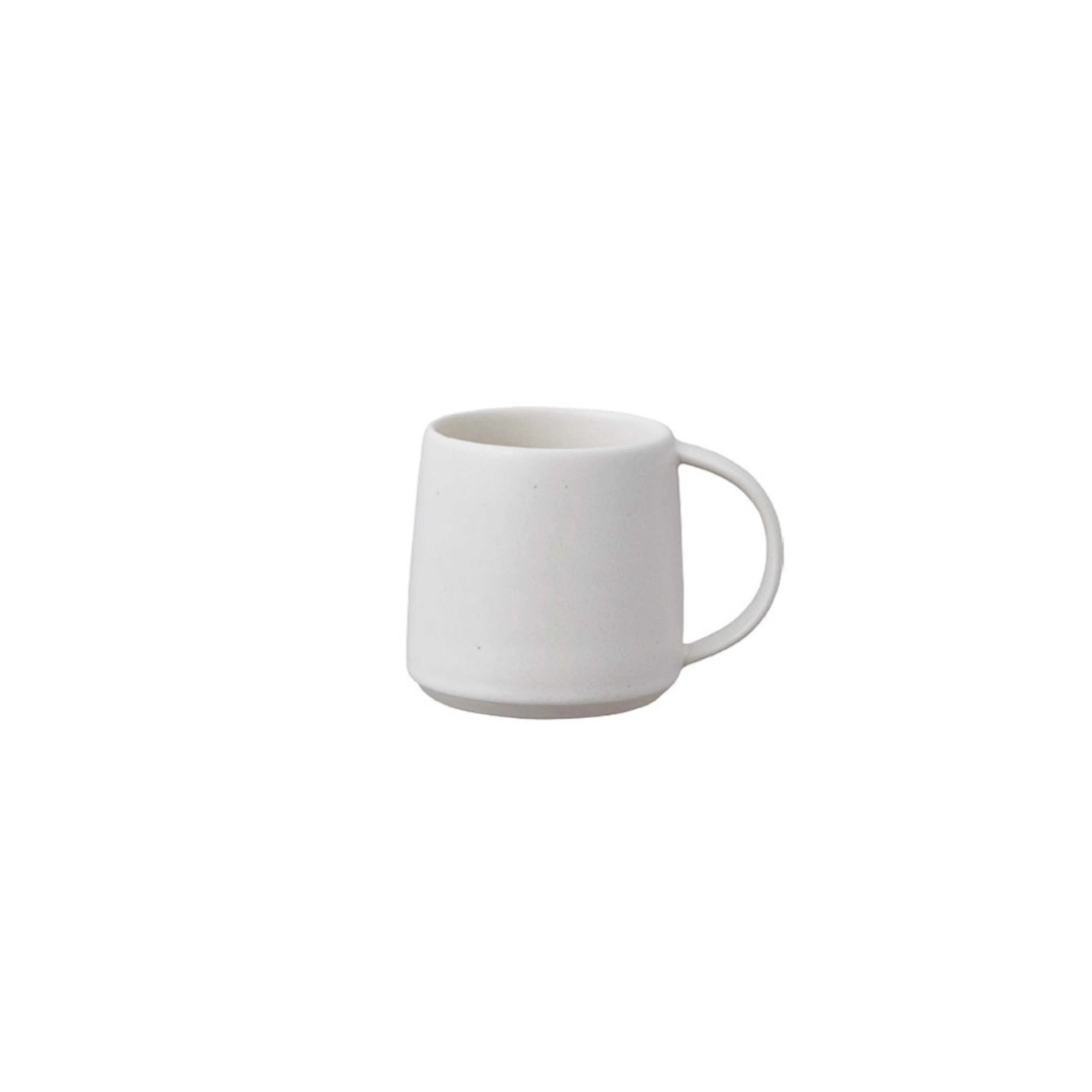
Kinto Ripple Mug
Sale price€20.40
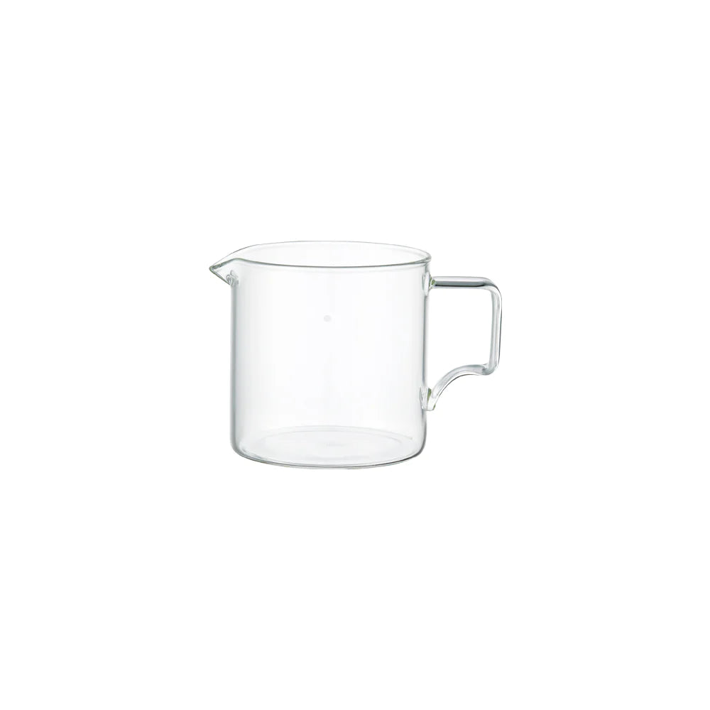
Kinto Glass Server 300ml
Sale price€15.00
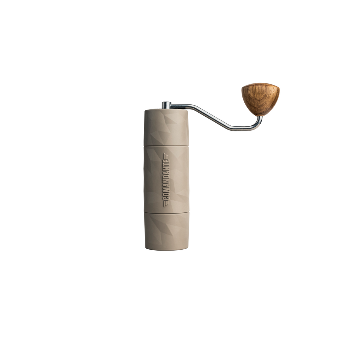
Comandante Trail Master
Sale price€249.00
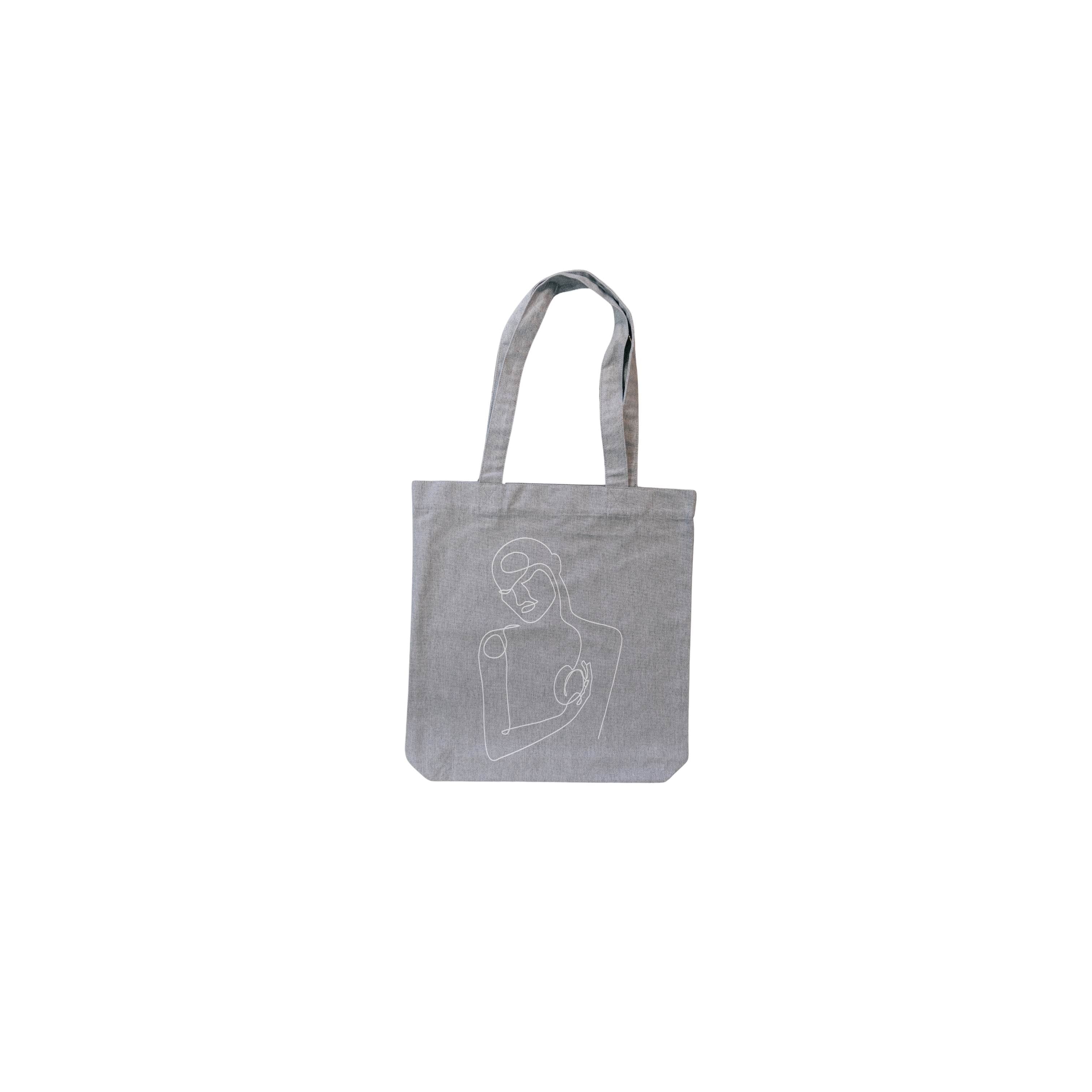
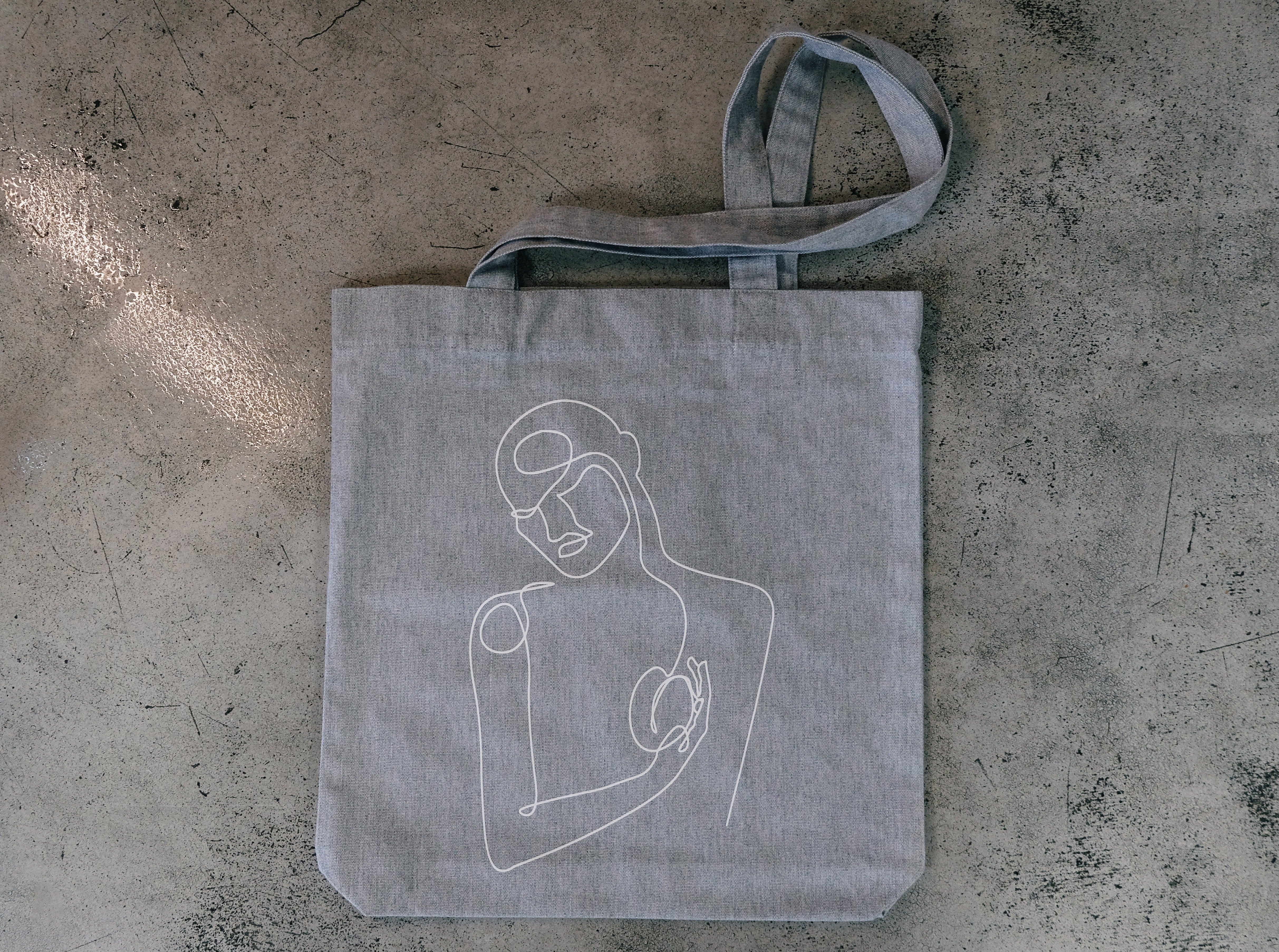
woven tote bag
Sale price€12.50
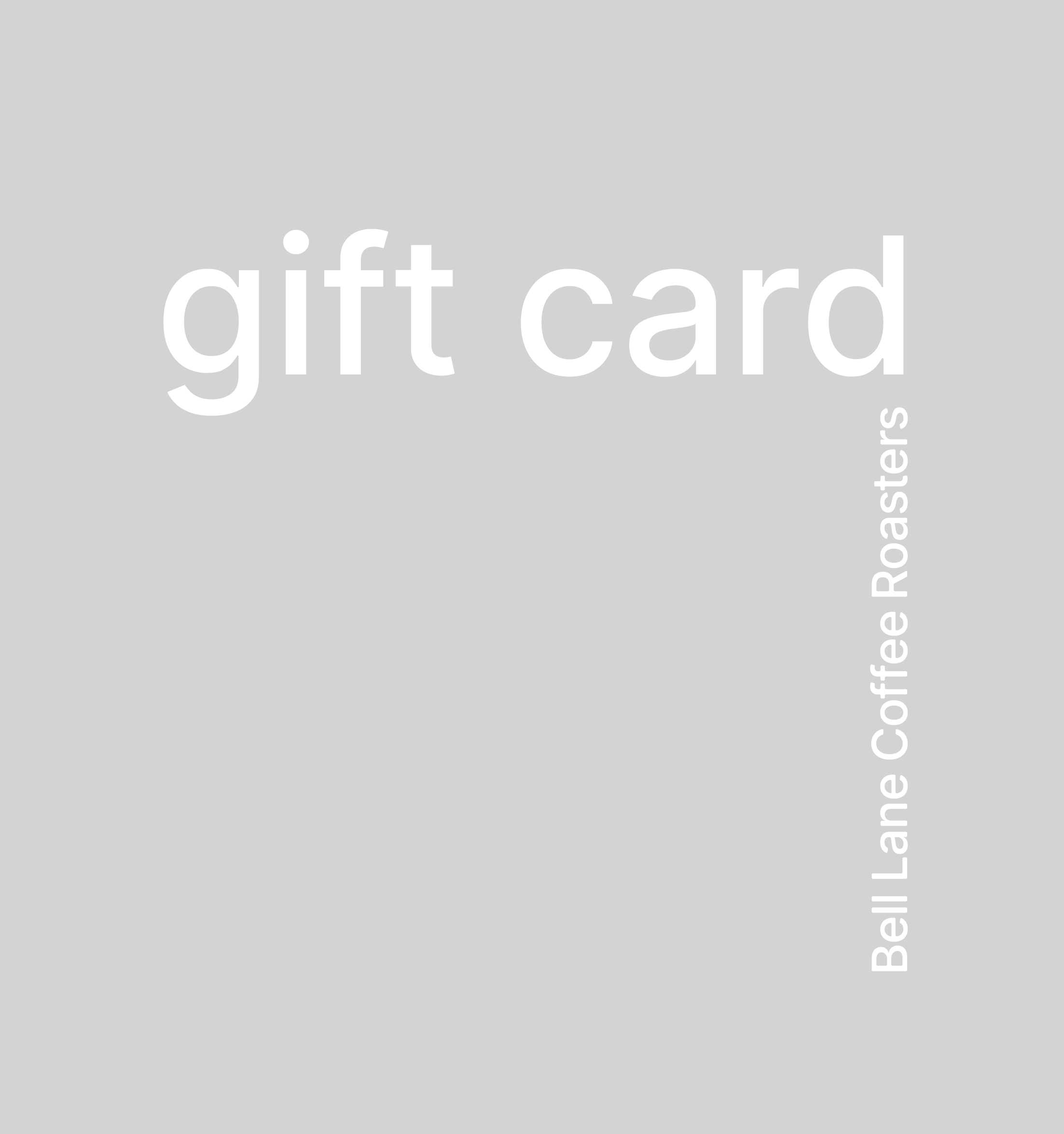
Bell Lane Gift Card
Sale price€25.00
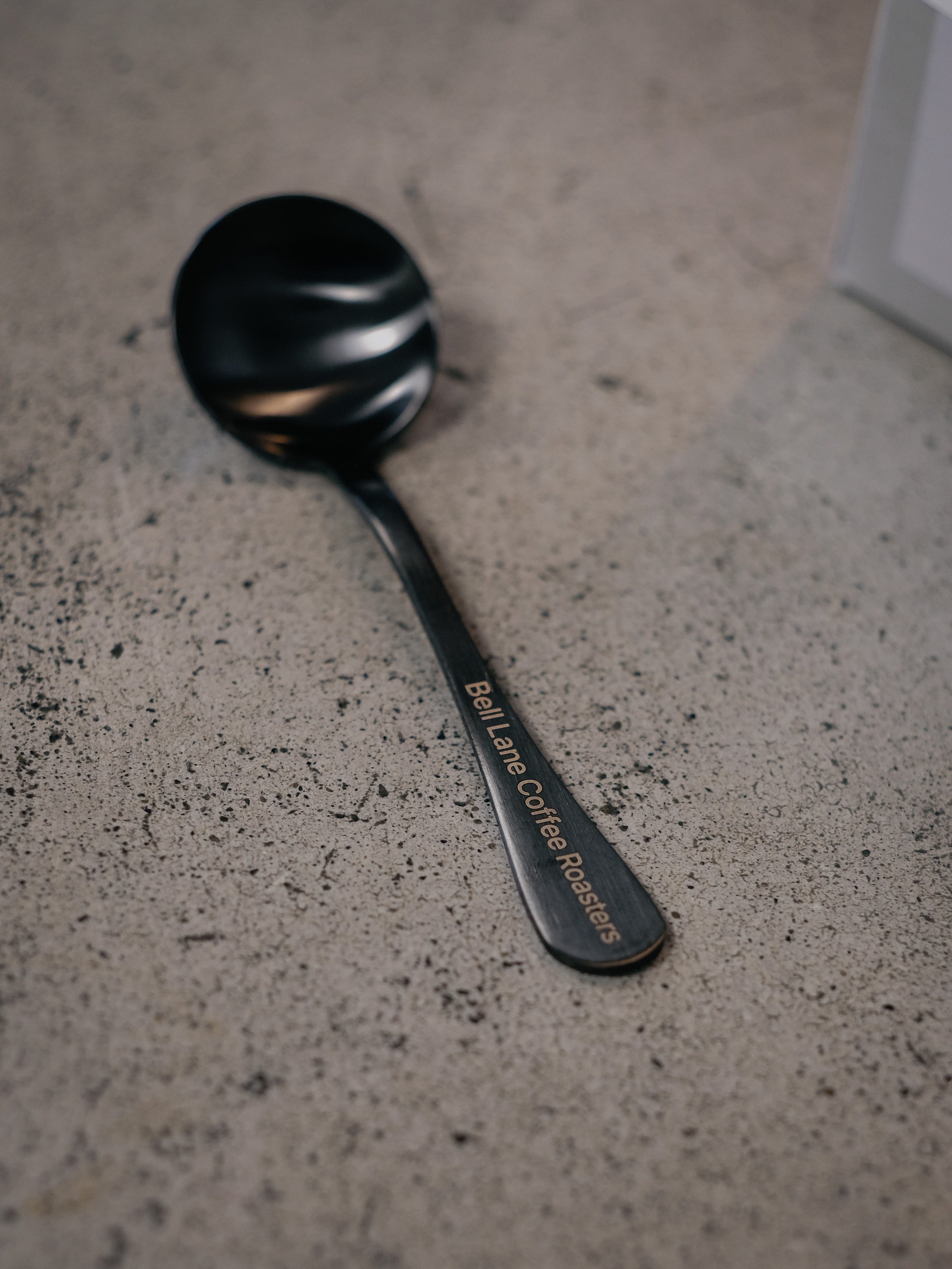
bell lane cupping spoon
Sale price€12.00
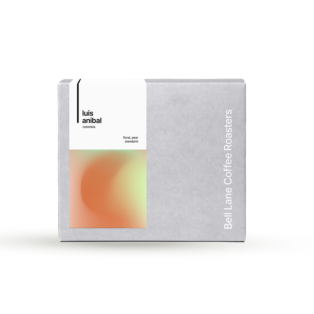
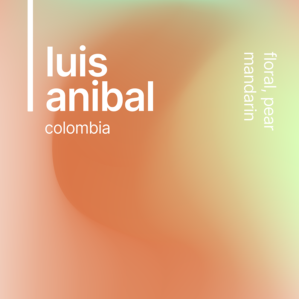
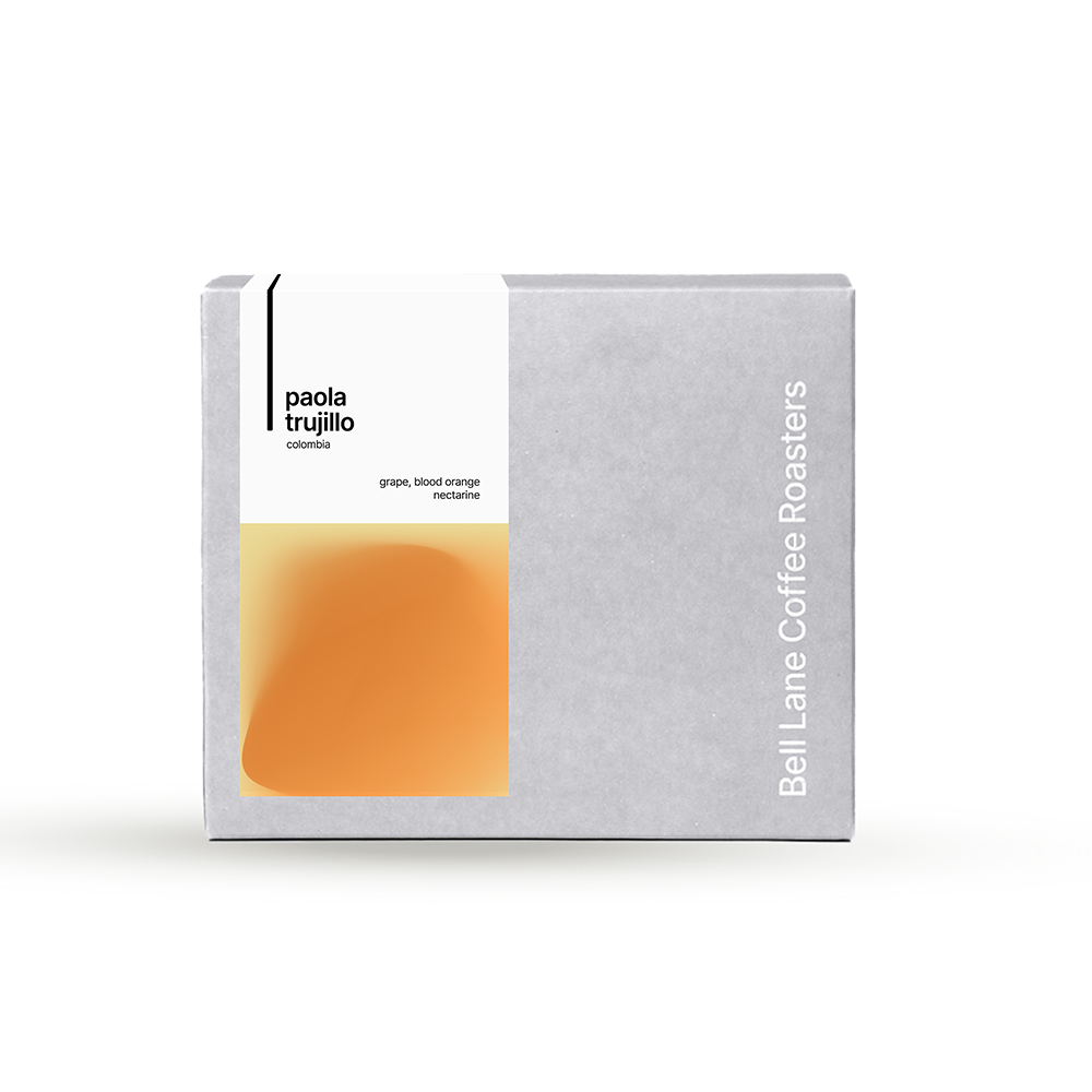
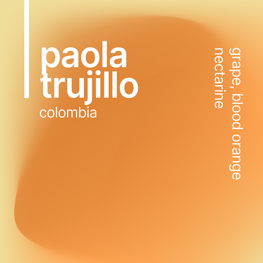
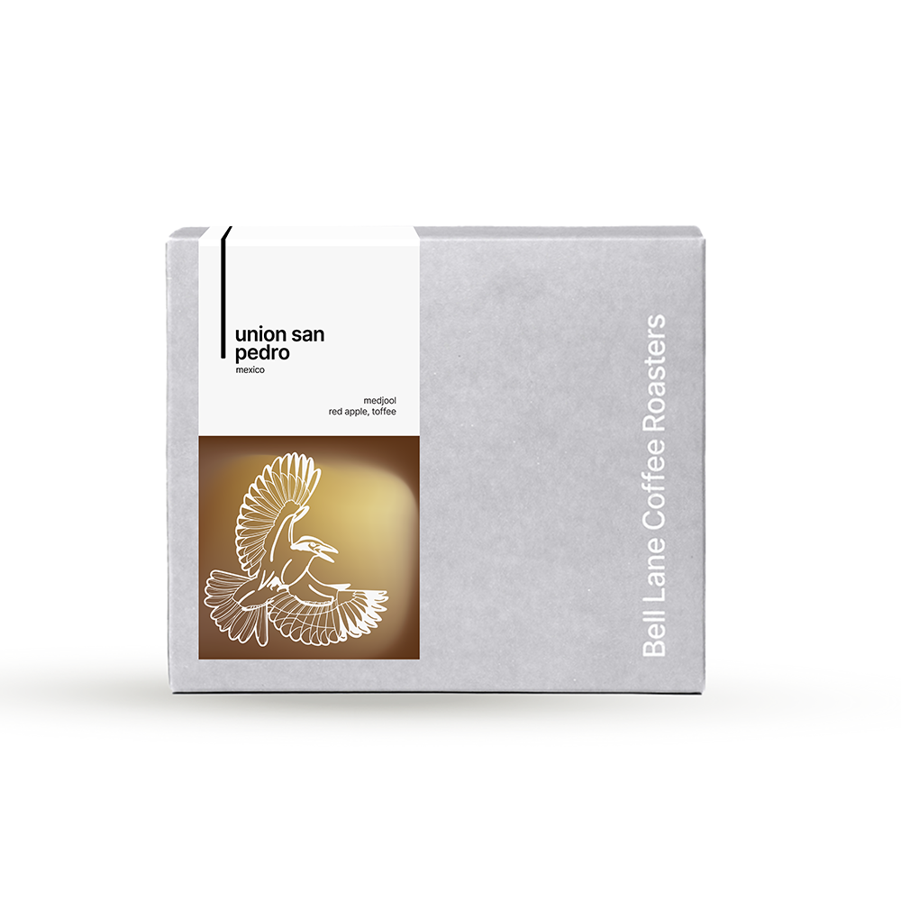
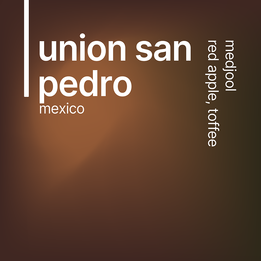
coffee in colour
Our labels are designed to reflect the tasting experience at a glance. Each colour is drawn from the tasting notes, giving an immediate sense of flavour. Linework represents the structure of the cup—whether notes are distinct or integrated—while brightness reflects the brew method, from filter to espresso.
our story
Since 2012, our coffee story has unfolded as a journey of constant learning and improvement. Building genuine relationships with coffee producers is at the heart of everything we do. We believe these connections matter because they mean better coffee for you and a positive impact on the communities we source from.
We partner with producers we know and trust, ensuring quality throughout every step of the roasting process. We meticulously roast beans to their full potential, honouring the hard work and dedication of skilled producers, resulting in a delicious cup that reflects the unique character of each origin.
community
Our partnerships are built on the principles of honesty, sustainability, and supporting coffee producers. This approach ensures both exceptional coffee quality and financial stability for the communities behind your cup.
responsibility
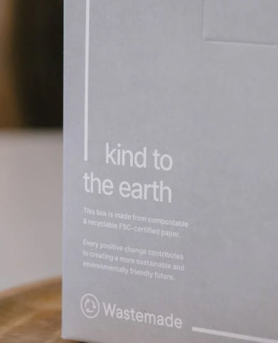
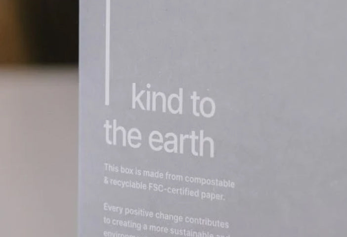
We are dedicated to minimising our environmental impact. This commitment starts with partnering with suppliers who share our values and implement sustainable practices throughout the entire coffee journey. This includes responsible sourcing, eco-friendly packaging, and utilising innovative roasting technology like our IMF roaster, which reduces emissions up to 98% compared to traditional drum roasters.
learn
Coffee is more than just a drink. It's an exploration of flavours, origins, and brewing methods. We're here to guide you, helping you find your perfect cup. We offer comprehensive training to our wholesale partners, and regularly open the roastery for interactive fun brew classes.
from journal
taking it easy at dublin coffee festival 2025
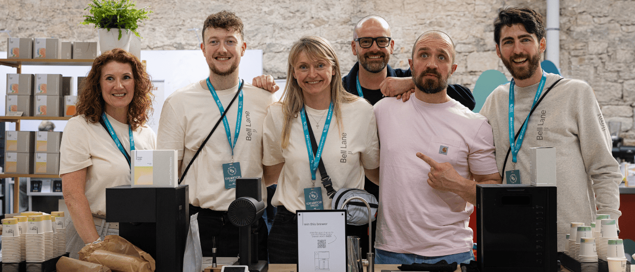
As lead coffee roaster sponsor at Dublin Coffee Festival, we knew we had an important role to fill—and plenty of prep to do. the venue Held in the historic RDS in Dublin across the weekend of April 12-13, the venue brought a real sense of occasion to the weekend. The old hall, high ceiling, and grand architecture gave the event a real sense of place—mixing an Irish landmark with its vibrant, growing coffee scene. The atmosphere was electric from start to finish, and Husky Events with Oli, Tom, Dan and team did an incredible job putting the event on, getting people on board, and running the event so smoothly over the weekend. the bell lane stand at dcf 2025 the concept Tóg go bog é (take it easy), was a full concept created by our in-house creative, Paul Flaherty, and extended from our stand design to our limited edition merchandise range. The hoodies, t-shirts, and totes sold out fast with only the socks surviving the weekend (which you can still get here). The illustrations were a hit—with Paul's dog Red making a guest appearance. our limited edition merch at dcf 2025 the stand The concept extended to our stand, designed by the brilliant Natalie Keville. From day one, our goal was simple—create an open, welcoming space where people could slow down, take a moment, and enjoy a coffee. We brought that to life across every part of the stand. Built around connection and calm, the central bar gave us the perfect space to serve coffee and conversation in equal measure. The light box drew people in, while the furniture from Woo Design offered a place to relax and take the weight off. the central bar and light box the coffees We had two DCF exclusives on the bar all weekend—both served from our Fellow Aiden Brewers. Wilder Lazo's White Honey Sidra was a complex and floral Colombian coffee, and a huge hit across the weekend. Meanwhile, Bryan Smith's Washed Gesha brought bright, citrus flavours and a clean finish. On our retail shelf, we also had Paola Trujillo's Sidra, Union San Pedro, and a taster box featuring Wilder, Bryan, and Paola. We even gave away one of the Aiden Brewers in a weekend-long competition—huge congrats to Margaret McCarthy, our lucky winner. wilder lazo, one of our two dcf exclusives the other competition As well as our competition on the stand, this year three of our own team—Luke, Paul, and Paulius—stepped up to compete in the Taster’s Cup to showcase their sensory skills. In a seriously competitive field, we couldn't be prouder of their effort and dedication in the run up. Well done lads—and watch this space next year! the launch Dublin Coffee Festival also marked the official launch of our new coffee labels—a project that’s been months in the making. Designed to better communicate taste at a glance, each label uses colour, linework, and brightness to express the unique character of the coffee inside. From bold espresso blends to delicate single origins, the new system gives drinkers a more intuitive connection to flavour. It was amazing to see people respond so positively to the change—and you can read the full story behind the label redesign here. our new labels on display at dcf our partners We couldn’t have pulled this off without help from some amazing partners: Woo Design - for our stylish, welcoming furniture Labo Mono - for supplying our sustainable sling bags Irish Sock Society - for our bold, colourful socks Stanley/Stella - for our t-shirts, sweatshirts, and tote bags Reda May - for capturing it all on camera Andy Nolan - for filming it all in high-res the community More than anything, the weekend reminded us why we love what we do. We caught up with friends from across the industry and chatted to coffee lovers from every corner of the country. From incredible home setups to curious newcomers, we were blown away by the level of knowledge and enthusiasm. We're already planning for 2026, and we can't wait to do it all again—bigger, bolder, and just as easy going. Until then, tóg go bog é. If you're a wholesale partner looking to start a conversation with our team, request a callback here.
Discover more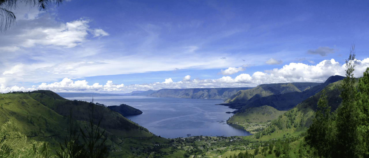
indonesia's blue batak and its 13th century roots
High above the southern edge of Lake Toba in North Sumatra—home to the largest volcanic crater lake in the world—you’ll find the ancestral lands of the Batak people, where coffee has been grown for centuries. Here, in a richly volcanic and staggeringly fertile region known as Lintong Nihuta, farmers have cultivated what is now known as Blue Batak: an Indonesian coffee with a story as compelling as its flavour. lake toba, north sumatra coffee with deep cultural roots The Batak people settled in this region as far back as the 13th century, and their traditions, connection to the land, and agricultural methods have shaped the identity of the coffee grown here. With a landscape marked by small valleys and ever-shifting microclimates, Lintong is a unique ecosystem for coffee farming. The soil is so incredibly fertile, thanks in part to a super volanic eruption over 70,000 years ago, that locals say, "you can plant a chair and it will become a table." Farms here are small, self-sufficient, and incredibly diverse. It’s not uncommon for local producers to grow over 10 different crops on the same piece of land. rich detail on a traditional batak building a distinct process: giling basah Blue Batak is processed using Giling Basah, also known as wet hulling—a method unique to Indonesia. It involves fermenting the cherries overnight in bags, sun-drying the parchment until it takes on a deep blue-green hue, and then hulling and drying further by hand over several days. The result? A cup with exceptional body, earthy complexity, and low acidity—distinctive hallmarks of this regional process. what it tastes like This coffee is all about depth. Expect camomile florals, forest-like herbal notes, and a layered cranberry fruitiness with a crisp, citric finish. It’s the kind of coffee that shifts and opens up as it cools—inviting multiple sips, slow mornings, and deeper appreciation. indonesian coffee cherries why we're excited We’re always on the lookout for coffees that carry a sense of place and incredible flavour—and Blue Batak delivers both. It’s complex, honest, and grown by people who have been perfecting their craft for generations. This is coffee rooted in story, soil, and soul. And we’re proud to add it to our lineup. If you’re a wholesaler looking to start a conversation with Bell Lane, request a callback here.
Discover more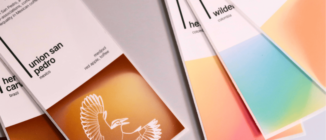
coffee in colour: the story behind our new labels
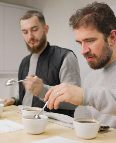
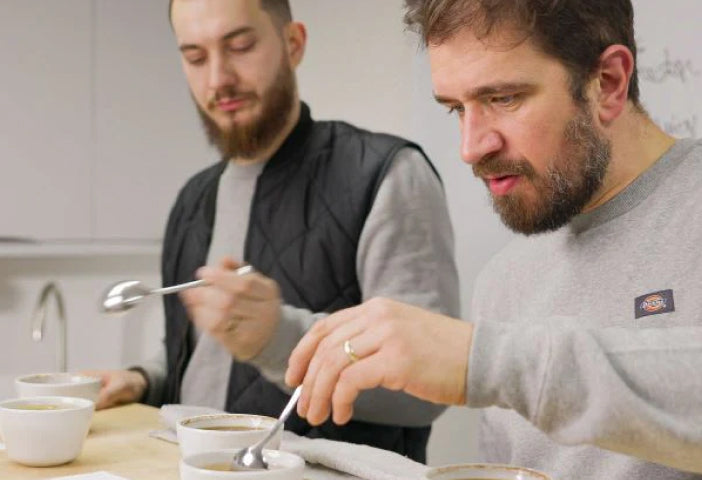
This is a project we’ve been working on for a while.And while you can see the end result on our packaging, we wanted to take you behind-the-scenes to explain how this change happened—and the thinking behind it.But before we look forward, let’s take a step back. the limitations of our old system Until recently, our coffees were grouped into five categories: citrus, exotic, floral, rich, and sweet.These served us well for a time and made it easy to navigate different tastes at a glance. But over time, we found ourselves limited by the very labels we had created.Coffee is one of the most chemically complex substances we consume and can contain over 1,000 chemical compounds—far more than wine. To box something this complex into five tidy buckets started to feel reductive.We knew there was more we could be saying. our five former categories how the colour purple changed everything The shift began with a moment in the cupping room—one of those moments we’ll never forget.Our Roastery Manager & Green Coffee Buyer, Niko, was tasting a coffee with the team when, instead of reaching for the usual flavour wheel terms, he said: “This coffee tastes... purple.”Everyone knew exactly what he meant, and instantly connected the colour to the taste. It wasn't blackberry, cassis, or plum. It was just...purple.That’s when it clicked. from colour to clarity Inspired by this, we began exploring a method more commonly used in the wine and food industries—crossmodal correspondence. This is where our brains perceive connections between what we see, nose, and taste to arrive at an overall impression. Using colour as the first step suddenly unlocked something for us. It gave us a faster, more intuitive, more accurate way to communicate taste.Instead of starting with a specific and finalised tasting note, we could now start with a first impression and move toward specific tasting notes. the sidra that set the standard The breakthrough became real during a cupping of Wilder Lazo’s White Honey Sidra.It was a quiet, layered coffee. We found it hard to pin down with our usual lexicon. So we cupped it by colour.We described the cup as: teal (cardamom) light yellow (camomile) muted green (rosemary) Rather than forcing it into a taste category, we let it speak through tone and hue. It just made sense. From that point on, we made the decision to cup our coffees by colour first. how the new labels work 1. colour We start with colour as a sensory anchor—a first impression that speaks to the taste inside. Brown might evolve to become milk chocolate, or nuts, or dates. Over time, orange can end up as blood orange, or nectarine, or clementine. By agreeing on an overarching colour first, we create a shared starting point for understanding the coffee's character—before diving into more specific tasting notes, Each coffee typically features three tasting notes (sometimes four), with the first note the most prominent—the one that defines the coffee at first sip. 2. lines Each label also features line work designed to reflect the clarity, depth of taste and mouthfeel in the cup. more lines = more separation and definition in the cup (typically filter coffees) fewer lines = more cohesion and roundedness (often espresso coffees) Think of it as a texture preview before you take your first sip. 3. brightness We also introduced a subtle brightness bar—a sliding scale on the label that indicates where each coffee sits on the spectrum from filter to espresso.It’s not about roast level—it’s about brew style. brighter = more clarity, better suited to filter brewing darker = more body, geared toward espresso coffee with impact As a Certified B Corp, we care deeply about the impact our coffees make at origin. Some coffees in our range go even further—championing sustainability, equity, and long-term community growth. To honour this, we've incorporated a series of icons into our label system—each one drawn from the story of the producer or collective behind the coffee. You’ll spot the great kiskadee representing Union San Pedro, the coffee-bean-carrying figure of La Morena, and the bold bull of Enrique López. These are our way of highlighting the coffees doing more—for people, planet, and future generations. try it for yourself Whether you’re a seasoned cupper or new to specialty coffee, we want to help you connect with taste—not decode it. Our labels are here to invite curiosity, spark recognition, and pay homage to the complexity of the coffee inside.
Discover more